The Web Surgery - Web Design UK


Call Us On:

London: 020 8144 6540

Lancashire: 01282 570 880


The Web Surgery - Web Design UKVideo Appointments

Schedule an appointment to discuss your project or training.

Skip to main content
Category

Web Design London

My West Midlands - discounts in the West Midlands

My West Midland Voucher & Discount Site Launches

By SEO, The Web Surgery, Web Design, Web Design Hammersmith, Web Design London

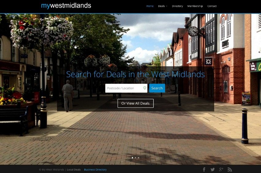
The Web Surgery have just launched the new Voucher & Discount website – My West Midlands

My West Midlands offers discounts to people who live in the West Midlands area.  The discounts are available online and include a countdown clock on each one showing the user when the offer expires.

We created a location service that allows users to enter their location, postcode or click an icon on the site and the software locates exactly where the user is.  With the What’s Around You function activated,  this showcases the latest local deals to you.  The website also allows users to view the offers on desktops, tablets and mobiles when they are on the go.

Website Address

www.mywestmidlands.com

Services Provided

  • Website Design and Build
  • GPS Location Finder
  • Countdown Clocks For Products and Services
  • Scrolling Images
  • Gallery
  • Video
  • Search Engine Optimisation (SEO)
  • Social Media
  • Blog
improve Website’s User Experience

How To Increase Your Website Traffic

By SEO, The Web Surgery, Web Design, Web Design Hammersmith, Web Design London, Web Design Solihull, Website Design Business

Bad SEO will kill your Business: Practices to avoid to keep Google on side

Statistics suggest that the first two organic positions on Google get around 51% of all search traffic. Those top spots are like gold dust and whilst you may feel like it’s worth doing anything to get there, the guys at Google and other leading search engines are savvy, all the old tips and tricks which used to catapult websites into that top spot are now amongst the worst practices you can carry out and black hat tactics and bad SEO practices could cost you dearly in the long run.

5 SEO Bad Practices to Avoid

Here are ten key things business owners simply must avoid to help keep their website on the good side of the search engines and moving closer to those coveted top spots.

1.  Duplicate Content

You won’t get away with copying. Copying large chunks of content from elsewhere without appropriate credit will not please Google in the slightest and even when you do provide credit, they won’t be impressed if your website is basically copied from elsewhere. If an article has already been indexed by Google and then you copy it, Google won’t even consider indexing yours so it’s wasted space. If you do need to copy or share content from elsewhere then use the noindex or nofollow tags within your coding.

2.  Guest Posting for Links

Outreach is a key part of your business’ development and it’s always nice to post content on other sites around the web to draw interest back to your own site. However, Google has grown clever to the act of simply writing the most basic, unengaging content for the sake of tacking a link back to your own page. Guest posting is brilliant if done properly but when it’s clearly a rush job and you’re doing it for the sole purpose of getting links, it won’t work in your favour. Highly relevant sites with high quality content which are of use to your audience are worth pitching to, but anybody else could be risky. The same goes for the opposite and accepting low quality guest posts for your site.

3.  Keyword Stuffing

This is the big one. It’s a practice which was absolutely done to death for many years. You’d find content which was barely readable because content creators were stuffing every sentence with searchable keywords. They took their time but the search engines caught on and repetition won’t work, it may result in penalisation and being pushed every further back in the SERPs. Your content needs to be written for your target audience, your relevant keywords and terms should flow naturally and this type of content is beginning to be viewed very positively and picks up social shares as well as pleasing the search engines.

4.  Too Many Ads

Too many ads spells bad news for your website, especially if they’re positioned above the fold. Not only will you alienate your users but Google has started to come down hard on websites which are too packed out with ads, especially positioned before the user can even see your content. Content first, advertisement later.

5.  Out of Date

An old website is almost as bad as no website at all. Google and the other search engines love fresh, new content and websites which are regularly updated tick many of their boxes. The design and structure of your website too needs to be in line with modern standards and sites which are just one or two years old become outdated and fall out of line with SEO best practices. Working with a professional web designer and checking in every once in a while with your chosen designer will help to ensure your website remains current and therefore keeping the search engines happy.

Contact Us

If you would like to find out more or have any questions then please get in touch with The Web Surgery.


improve Website’s User Experience

Why You Need Good Web Design and Marketing

By The Web Surgery, Web Design London, Website Design Business

The Importance of Good Web Design and Marketing

When launching a new company, website or brand, you need to fire from two barrels. A good web design is one thing, a good marketing campaign is another but without both working closely together, you are unlikely to have any success.

If your website design is not focused on converting customers then the traffic that arrives at your website, if there is any, will not deliver any return on investment. Your design and marketing strategies should be interlinked, designed in tandem and be a solid partnership for both bringing in potential customers to your site and keeping them engaged when they get there.

Bad Design = Boost in Bounce Rate

At The Web Surgery we analyse websites every single day and find many have increased bounce rates as people land on the site. The bounce rate is calculated by working out how long users spend on a website once clicking onto it and high bounce rates signal people simply don’t like what they see when they land on a site. There are many reasons for this, it could be simply personal preference, a clashing colour scheme or a website that simply isn’t user friendly. A well-designed website will be very easy for potential customers to navigate, on first click they’ll be able to find what they’re looking for and in many instances, they’ll keep things simple. Take a look at websites like Apple, Selfridges, Mini and Sony, they let their service and products do the talking without an intricate and complicated design.

A knock on effect of a website that customers simply don’t connect with is a lack of engagement. If potential customers simply click off then they’re not engaging and they’re certainly not sharing. Your website is your window and much like anything else that people invest their time and energy in, they want it to look good. A good design instils trust in your company and it keeps people engaged, as well as encouraging them to come back time and again.

Digital Marketing Matters

So, your website is great, it’s user-friendly and customers are engaging and more importantly, buying from you. Do they come back for more? Do you have an influx of new customers on a regular basis? A great website is one thing but if you don’t promote it effectively and keep it fresh and exciting the initial interest will soon tail off.

Your digital marketing strategy needs to be rock solid, it needs to evolve with changes to social media and the ways we access the web and it needs to engage with your target customer in every possible way. Your digital marketing campaign should be structured and include both regular and mobile elements, it should take into account social media, fresh updated content, email subscription services and more. Dependent on your business you should consider each of these steps in turn and see how they can be implemented and work for your company.

Good web design and good marketing should work together to keep potential customers engaging and sharing your content, interested in your products or services and ensure your business succeeds.

Contact Us

If you would like to find out more or have any questions then please get in touch with The Web Surgery.


improve Website’s User Experience

5 steps to improve your website’s user experience

By The Web Surgery, Web Design, Web Design Hammersmith, Web Design London

5 Steps

The most important thing about any website is the user experience it delivers. Your UX is what is going to make your website memorable and keep your customers coming back and remaining loyal. Your website has to offer a good UX and this can be achieved in many ways, some more technical than others. Ensuring your website is as user friendly as possible, as quick as possible and as well organised as possible will really help impress your potential customers.

User experience can broadly be defined as all aspects of end-user interaction with your company, your services and your products. Something as broad as that can be hard to focus in on but here we’re looking at five ways you can definitely make a different to your UX for the better.

1.    Faster Page Loading Time

Around 40% of all visitors to website will abandon them if they take longer than three seconds to load. That doesn’t give you much leeway and highlights how important fast loading time actually is. Three seconds isn’t much time to make a good impression but you need to use every second you can. A professional design can help speed up that page load time but simple tricking include resizing or removing large images that aren’t central to the content, eliminating flash files and reducing the number of plugins you’ve added to your site. You can also make use of the cache for your site so it doesn’t have to fully reassemble every time someone visits.

2.    Clickable Images and Logos

Many of your visitors will want to visit many different pages of your website and have gone from page to page without returning to the homepage. This means they will have the click back several times before getting to the homepage, which can be inconvenient. Instead make it easy, make all logos clickable so users can navigate with ease.

3.    White Space

We’ve talked about white space in several blog posts but it needs to be mentioned here again. Your text matters but the spacing between your text matters too. White space helps your users absorb the information you’re providing and it’s aesthetically pleasing and inviting too. White space can also be used to help the most important elements of your website stand out and become more noticeable.

4.    Search Friendly

Note we’re saying SEARCH friendly not search engine friendly. SEO matters but it has no role to play in your UX and in fact all this point means is that you should ensure you have a functional search bar on each page of your site. A search bar allows your potential customers to seek and find exactly what they’re looking for.

5.    Responsive

We’ve already dedicated a whole blog post to responsive design but once again it needs to be mentioned. You want your customers to be able to access your website, whatever device they choose to use and this includes those with smaller screens. To ensure this is possible you need to ensure your design is responsive as this allows your design to adapt to any screen and be perfectly accessible and usable in every context.

These five elements of your website can really help or hinder your UX. You want your potential customers to find your site easy to use as well as being impressed by its design so ensure you keep these points in mind for success across the board.


If you would like to find out more or have any questions then please get in touch with The Web Surgery.

eLearning Web Design

Designing eLearning Websites

By E-Learning, The Web Surgery, Web Design, Web Design London, Website Design Business

eLearning Websites

eLearning is a huge business and though the main element of any eLearning experience is the course content, the design also needs to be right. To deliver effective courses with high pass rates and positive feedback the overall impression you give needs to be second to none, here are some tips to keep in mind when designing eLearning websites.

Find your Focus

The design involved in the development of an eLearning website is all about focus. The design should serve to draw attention to the most important elements of each course and make the core subject matter as relevant as possible for the individual learner. Page hierarchy should be designed around those elements that really need to stand out and ordered in a way to ensure they do. Making use of typography and graphics can help to bring out the key elements clearly.

Question every Decision

eLearning websites have a purpose, they exist to help users learn a new skill, gain a qualification or to support their classroom learning. Therefore every resource you add or use in your design should be questioned and there should be a reason for it. It can be very easy to get carried away with packing a site with great images, graphics and different fonts, leaving it impenetrable to the user. Make every decision with care and consideration, keeping the purpose of the site in your mind at all times.

Spacing Matters

As we’ve said, the content of the course is what the students really want but this doesn’t mean the site should be populated with dense chunks of text. This simply leads to cognitive overload and doesn’t support learning. Narrow text blocks which are broken up into smaller paragraphs or with graphics or bullet points will be more successful.

Simplicity Works

Users accessing an eLearning course are there to learn, nothing else. You need to make it as simple as possible for them to navigate around the site and ensure they can access it through a range of devices, smartphones and tablets as well as regular computers. Key buttons such as NEXT and related symbols should be clearly displayed, ensuring the user can get around the course with ease and not become frustrated by fussy graphics or unnecessary clutter.

An eLearning website is a tool that students use to maximise their potential and the last thing they need is a sloppy or overly intricate design blocking their success. A simple and clean eLearning site which guides the user through their options quickly and easily, is the most effective type there is.

Contact Us

If you would like to discuss the building of your eLearning platform or courses then please get in touch with The Web Surgery here.

What’s wrong with Using Website Templates?

By The Web Surgery, Web Design, Web Design London, Website Design Business

Using Website Templates

Designing your website takes time and effort and many people try a few DIY methods before they realise a professional designer is the way to go. There are plenty of DIY websites out there that look as good as professional designs but most of them aren’t based on standard design templates. Using standard design templates rarely provides a result which is unique, stands out and best represents your brand.

There are many reasons you shouldn’t use a predesigned website template and below we’re looking and five key elements which show exactly with a design template is bad for your business.

1. Limits Branding

Your website plays a key role in promoting your business and having somewhere to display clearly and concisely exactly what you offer. Using a generic pre-designed template is not an effective way of ensuring that your business stands out. Using a template which can be seen on hundreds of other websites is not going to make you recognisable. Even if you add custom logos and content, you will still have a design which makes people click past rather than engage. Starting from scratch allows you to present the image you want for your business with no interference from the predesigns of others.

2. Still Requires Customisation

If you have no design experience then you won’t be able to just click a button and get what you want, even with a template. You will still need to make some edits and dependent on the CMS you use and the template you choose. Tweaks will be required and the frustration they bring if you’re not experienced in this area can slow progress and take much more time and energy than you had planned. Without any design experience this process is complex and will probably end up costing more in time and effort than hiring a designer.

3. Templates are restrictive

Although there are hundreds, if not thousands, of design templates out there, they are still restrictive in what they can offer. Many template designers have licensing agreements in place which restrict exactly how many changes you can make and limit the ways in which you can use the website. Some templates also include a link back to the original designer which may not be something you want displayed on your site.

4. They Look the Same

As mentioned, you will find lots of people trying to do things DIY and this means it won’t be long before you spot at least one other site which looks very similar to yours. The last thing you want is to get lost in a sea of websites that look the same and unfortunately, even with your tweaks and changes, each template is not exclusively yours and you will find others that look the same.

5. SEO is Forgotten

The designers behind many pre-made templates are getting a little savvier in this area but it hasn’t always been the case. Plenty of designers simply haven’t got SEO in mind when putting together a set of pre-made templates. A professional designer working on a bespoke basis implants elements which effect SEO positively within their coding but in most cases, this isn’t true of the designers behind pre-designed templates.

6. Problems under the Surface

Most of the self-build websites on the market look great on the surface but a little digging shows a different story. Many of the self-build templates on the market trick customers into paying for free features and customization which a web designer would carry out naturally as part of their package. You may find yourself paying extra for elements you shouldn’t including SEO marketing and analytics.

7. All Style, No Substance

Many of The Web Surgery clients arrive with self-build websites which simply don’t do the job they need. They may look great, although this isn’t always the case, but they don’t have the functionality the customer needs. They may get plenty of first-time visitors but customer retention is a problem and as soon as problems are found with the functionality of a site, many customers simply don’t come back. The appearance of your website is only one small factor, behind the scenes hundreds of different processes need to be tested and perfected to ensure you deliver a user experience that ticks all the boxes, rather than just looks good but is completely no use.

8. Not Responsive

Though this is changing a little, many of the self-build templates and themes out there are not responsive and this is a disaster in 2014. Mobile web use is growing faster than anybody could have imagined and by 2017, it’s predicted over 90% of internet users will be accessing the web via their smartphones.

A responsive website adapts and changes to fit the screen size in question as well as changing elements to ensure fast loading on mobile phones and tablets. It allows your website to deliver an effective mobile user experience as well as the one delivered to computer users. Without a responsive design your website will look distorted, the wrong size or may even be impossible to read or access at all. As we’ve said, most templates do adapt to different screen sizes but what if you don’t like the changes? You should be as invested in your mobile design as your computer-based one but with a self-build design it is tough luck, you just have to live with it.

This is the case against website templates and why you are always better off with your own professional designer, working to your brief and ensuring your exact branding needs are met. You will get what you pay for with a self-build template and the same can be said of a properly build website by a professional. Yes, the initial cost may be higher but in the long term you will benefit from an adaptable, quality user interface which not only satisfies your customers but more than achieves its ROI.


Contact The Web Surgery

If you would like to know more or find out how we can help you then please call us on 020 8144 6540 or contact us at www.thewebsurgery.com/contact
Tips for Better eCommerce Web Design

By The Web Surgery, Web Design, Web Design Hammersmith, Web Design London, Website Design Business

eCommerce Web Design

eCommerce web design is a very specific niche which requires specialist knowledge. The evolving state of the web means you need to shout to stand out and though there will always be stiff competition with an effective and well thought out design, backed up by a strong marketing strategy, should see you on your way to success.

Perhaps more so than any other business, an eCommerce website has to work. It has to be effective and offer a quality user experience that allows customers to browse and buy with ease. Many eCommerce websites tick all the boxes when it comes to their look and feel but the customer experience and engagement levels are through the floor, highlighting that web design is about more than graphics and templates. Below are some tips which are essential in delivering effective eCommerce websites.

Design that supports Engagement

Your eCommerce website doesn’t need to be a feat of graphic design, of course quality imagery helps, but more than anything else it needs to engage. Keep your target customer in your mind at all times when discussing your design plans and think about what they need and what will draw them in. Engagement is key in eCommerce design and the main purpose of your website is simply to turn prospective sales into actual transactions without any frustration or effort needed on the part of the customer. Customers need to be able to browse your products with ease, share them on social media and understand exactly how they work. Your product gallery needs to be as easy to navigate as possible and though colour and style matters, you need to look more in depth than that. Analytics are key to getting engagement right, looking closely at drop off rates and the pages that aren’t performing so your sites can be tuned even more closely.

Effective Mobile Strategy

It’s no longer news that the world is driven by mobile web access although to look at some of the big branded sites out there you’d be surprised. A study carried out by the Interactive Advertising Bureau in 2013 found that only 11% of the highest spending advertisers’ had responsive websites for use on tablets and mobiles and though we reckon this has probably changed now, it does highlight how important responsiveness is. In 2013 again Monetate found that more than 10% of all eCommerce traffic came from tablets and conversions were also higher from this type of device. Your eCommerce website simply has to be responsive to ensure your potential customer’s experience is of high quality across the board.

Guide your Customers to Buy

A good eCommerce website will drive your customers to purchase. The design of the site will lead them to add things to their basket, direct them towards offers and show them the most important features of your site. Every element of your website needs to be considered with your target customer in mind – keep it simple and you’ll soon see results. There’s nothing wrong with a strong visual brand but it needs to have a technically effective website behind it.

A professionally designed eCommerce website sets your business up for a good start and allows you to wow your customers and converting these good impressions into sales.

Looking For eCommerce Web Design

If you would like to find out more then please contact The Web Surgery.

What Your Website Needs To Contain

By The Web Surgery, Web Design, Web Design Hammersmith, Web Design London, Web Design Richmond, Web Design Solihull, Website Design Business

web design londonFive Elements every Business Website Needs

Your business website should provide you with a direct opportunity to sell yourself to potential clients. This means more than simply showing off your goods or service though, it means letting them know what you’re all about. Human beings are naturally inquisitive and therefore the chance to get a better feel for the people behind the brand often goes down well too. Anyway, first things first, here are five critical elements that are essential to an effective business website.

Attention Grabbing Headline

The first thing people should see when visiting your website its headline, a tagline perhaps which concisely and clearly tells them what you do or what you offer. It should show off the most important benefit of your product or service. You need to stand out from the crowd and offer something unique and you need to tell every visitor this as quickly as possible, piquing their interest and keeping them engaged.

Effective Copy

Though this many not be down to your designer it is something you can discuss with them, especially if they have a marketing team or contacts in the industry. Your copy needs to be promotional and sales-orientated without being over the top. Your users want to know what you’ve got to offer but they don’t want it rammed down their throat. Your copy should highlight exactly why you visitors need your product or service and also instil trust.

User-Friendly Navigation

A confusing or slow website never keeps customers coming back for more. If you want your customers to come back again and again then you need to put their first. User experience has to be your number one priority and this means simply and clear navigation, an accessible menu and regularly testing page load speeds to ensure they’re fast enough to keep customers coming. Super-sized images and cluttered pages can slow down speed along with a range of underlying issues which may become apparent if you opt for a predesigned template or DIY website.

The Right Images

Images are part and parcel of what sells your business, especially if it is product based. Product shots can really lift the effectiveness of your website but erring on the side of caution when it comes to size and resolution will help ensure your page loading time isn’t scuppered. Thumbnail images are the best way to go for websites with a large product range as they allow for speedy load time and the option of enlarging the image where necessary.

Call to Action

If you want your website to result in sales then it needs to do more than show off what you can do, you need to actively direct people to make that purchase. Your call to action needs to be clear, bold and easy to follow. Easy to understand directions on how to make a purchase will ensure customers have no confusion when it comes to clicking that link and buying the item in question.

With these key elements in place your website will have the basics it needs to attract the right kind of attention.

If you would like to know more or find out how we can help you then please call us on 020 8144 6540 or contact us at www.thewebsurgery.com/contact